Creating a simple 3D button with pure CSS
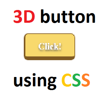 I'm sure that all of you might have seen a 3D (Three Dimensional) button in a website somewhere. There are many websites which use 3D buttons to grab the user attention; they are really interesting to check out as well as to create. So here is my very simple approach to create a 3D looking CSS 3 button. This is the very basic way to create a 3D button in CSS and it does what you expect. It has a 3D appearance; it has a 3D effect when you click on it :)
Here is the demo of the button.
NOTE: This was made only for fun. If you willing to use this in your website, you may consider to modify this.
CODE:
 <html>
    <head>
        <style>
            div { width: 100px;
                  height: 30px;
                  background: #F8D96D;
                  border-bottom: 7px solid #7F5A23;
                  border-left: 3px solid #7F5A23;
                  border-top: 1px solid #7F5A23;
                  border-right: 1px solid #7F5A23;
                  border-radius: 8px;
                  text-align: center;
                  padding-top: 10px;
                  color: #ffffff;
                  font-weight: bold;
                  font-size: 18px;
                  text-shadow: 5;
                  cursor: pointer;
                  text-shadow: 0px 2px 3px #555;
            }

            div:hover {
                background: #F7D86B;
            }

            div:active {
                border-top: 4px solid #7F5A23;
                border-bottom: 1px solid #7F5A23;
            }
        </style>
    </head>
    <body>

        <div>
            Click!
        </div>

    </body>
</html>


