Customize Gmail's new Material UI to look better!
Good news folks, Gmail launched it's new user interface with a cool material design a few days ago and I promptly switched to it. Like every other web developer who questioned "why Google doesn't introduce the material design UI to Gmail?", I too was concerned on the same, and I knew it would be there someday soon. Now it's released and I'm happy with the new version so far. It looks good, user friendly and not so heavy on the browser (surprisingly).
However, reminding us all that nothing is perfect, I found that a few elements of the new UI are not up to my tastes (Seems a bit difficult to read, specially the bold subjects and the font size). So I changed it to make it look how I like. If you too want to make some changes to it, this is how I did it. It's really easy, but I did this in Firefox <3 only.
So what we are going to do here is apply a custom style sheet on top of the Gmail interface. You can do it easily in Firefox. Remember, we apply the changes to the browser, not to the web page itself. So we need to change the browser's style sheets, which will be applied to the websites we ask on it.
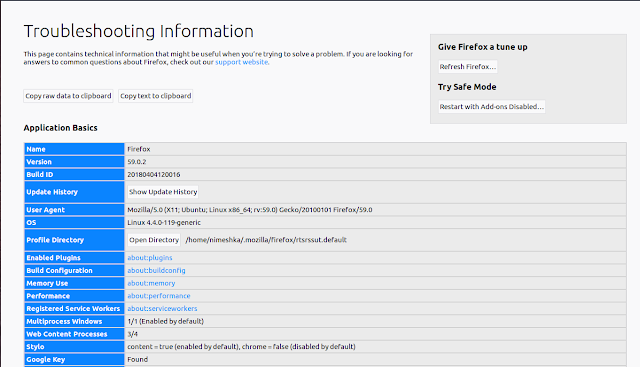
First select Help -> Troubleshooting information from Firefox tool bar. It will open you a page with some configuration values table. In the table, under the Profile Directory row, you will see a button named "Open Directory".
Click on it and you will be taken to your Firefox profile directory. Now create a new directory and name it as "chrome" (If this directory already exists, you can skip this step.)
Now, inside the new directory you created, make a new file and call it as "userContent.css". You can add the following styles to it to make any changes you wish to see in Gmail interface.
What's important here is that, you have to write all your styles for Gmail within the outer css rule. That is: @-moz-document domain('mail.google.com') {}.
Now if you restart Firefox and access Gmail, you will see your fonts are a little bit expanded and very readable. I also changed the font-weight to 500 to reduce the boldness.
If you are used to the old Gmail interface and it's fonts, I recommend to change the fonts to "Sans Serif", but if you do so, remember to change the font-weight ;)
As you might have already guessed, you can use this same method to apply custom styles to any website you want :) Just change "mail.google.com" to whatever the domain name you wish.
That's it guys! I hope this post is clear. Please feel free to ask anything on comments and don't be hesitant to point out if I have done anything in a wrong way :)
However, reminding us all that nothing is perfect, I found that a few elements of the new UI are not up to my tastes (Seems a bit difficult to read, specially the bold subjects and the font size). So I changed it to make it look how I like. If you too want to make some changes to it, this is how I did it. It's really easy, but I did this in Firefox <3 only.
So what we are going to do here is apply a custom style sheet on top of the Gmail interface. You can do it easily in Firefox. Remember, we apply the changes to the browser, not to the web page itself. So we need to change the browser's style sheets, which will be applied to the websites we ask on it.
First select Help -> Troubleshooting information from Firefox tool bar. It will open you a page with some configuration values table. In the table, under the Profile Directory row, you will see a button named "Open Directory".
Click on it and you will be taken to your Firefox profile directory. Now create a new directory and name it as "chrome" (If this directory already exists, you can skip this step.)
Additional Info: For those who wonder, "chrome? in Firefox? why?". Here's the answer: In GUI terms, a window of an interface is usually known as a chrome. So this is not making any references to Google Chrome ;)
Now, inside the new directory you created, make a new file and call it as "userContent.css". You can add the following styles to it to make any changes you wish to see in Gmail interface.
@-moz-document domain('mail.google.com') {
    .yW {
        font-size: 15px !important;
    }

    .zA > .a4W {
            font-size: 15px !important;
    }

    .zF, .bqe, .bq3 {
            font-weight: 500 !important;
    }
}
What's important here is that, you have to write all your styles for Gmail within the outer css rule. That is: @-moz-document domain('mail.google.com') {}.
Now if you restart Firefox and access Gmail, you will see your fonts are a little bit expanded and very readable. I also changed the font-weight to 500 to reduce the boldness.
If you are used to the old Gmail interface and it's fonts, I recommend to change the fonts to "Sans Serif", but if you do so, remember to change the font-weight ;)
As you might have already guessed, you can use this same method to apply custom styles to any website you want :) Just change "mail.google.com" to whatever the domain name you wish.
That's it guys! I hope this post is clear. Please feel free to ask anything on comments and don't be hesitant to point out if I have done anything in a wrong way :)


